

Hot, What's Hot
Eccentric Pastels: a new adventure for calm designs

Aug
Eccentric Pastels
So what are ‘Eccentric pastels‘.
Eccentric pastels or ‘bright pastels’ are a twist on the previously fairly tame designs and colour palettes associated with pastel shades. By taking a traditionally conservative and relatively calm design approach and adding additional elements, designs are able to combine the best of both worlds.
Forget the usual suspects of baby products and cosmetics, brands and designers are using Bright Pastels to create new connections that counter the ‘shout’ culture of label designs that have previously dominated our shelves. They are doing it in the following ways:
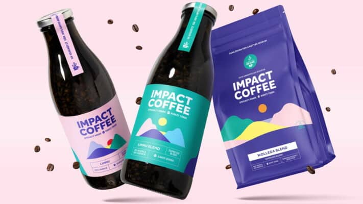
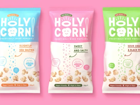
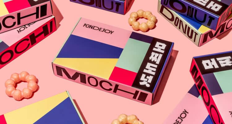
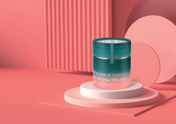
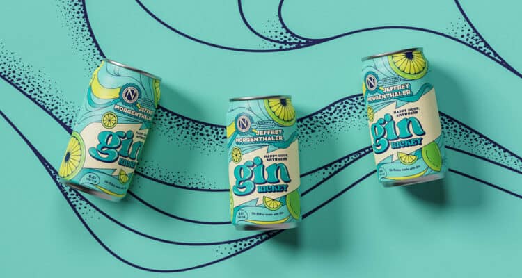
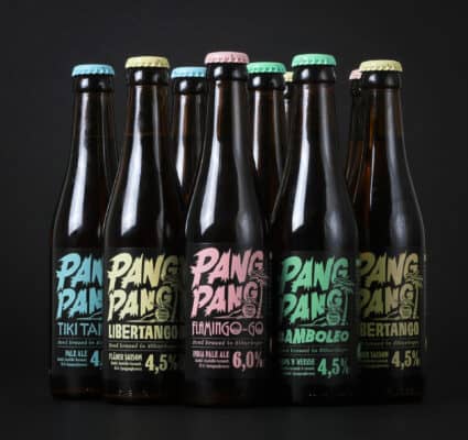
Eccentric pastels give rise to a new and distinctive version of Pastels, stimulating new excitement that is an escape from unadventurous and ‘shouty’ designs. They create an intimate yet distinct representation of colours that influence purchase decisions and make a positive impact on purchasing decisions.
So as it turns out, Eccentric pastels looks like the new normal for label design for 2022.
Discover more trends here